tiket.com | Work Experience (2014-2024)
• Key Visual Approach
The process of refreshing the key visual involved a grid system and visual components such as typography, product icons, and benefits, which later served as a reference for digital and print banners. Various factors were considered after going through input from multiple stakeholders. Along the way, more pain points were identified, which, in turn, led to more solutions—making the process even more engaging. *Copywriting supported by Dimas K, Rizky Pradipta.


At the stage where the focus shifts more toward direction, the application of key visuals is divided into three types: T-man & friends, as mascots, with immersive backgrounds (stock photos / AI-generated), Human Presence with immersive backgrounds (stock photos / AI-generated), and Immersive Backgrounds (inventories / AI-generated). *Creative Designer Specialist-3D Illustrator: Rizal Zulfadli.


• Sobat Jalan Aussie
Tiket.com teamed up with the Australian Embassy to invite travelers to experience the real vibe of Australia through the Sobat Jalan #AussieBanget series, featuring travel creator Marischka Prue. The campaign offered lucky participants a full trip to Perth and Brisbane including round-trip tickets and accommodation all wrapped in a fun, adventurous storytelling theme. For this campaign, I worked as the visual designer, handling the key visual direction, logo design, and promotional banner design across multiple platforms, including Tiket.com’s social media channels. *Copywriting supported by Dimas K.


tiket.com | Work Experience (2014-2024) | Other Highlights
• Key Visual Approach
The process of refreshing the key visual involved a grid system and visual components such as typography, product icons, and benefits, which later served as a reference for digital and print banners. Various factors were considered after going through input from multiple stakeholders. Along the way, more pain points were identified, which, in turn, led to more solutions—making the process even more engaging. *Copywriting supported by Dimas K, Rizky Pradipta.


At the stage where the focus shifts more toward direction, the application of key visuals is divided into three types: T-man & friends, as mascots, with immersive backgrounds (stock photos / AI-generated), Human Presence with immersive backgrounds (stock photos / AI-generated), and Immersive Backgrounds (inventories / AI-generated). *Creative Designer Specialist-3D Illustrator: Rizal Zulfadli.


• Sobat Jalan Aussie
Tiket.com teamed up with the Australian Embassy to invite travelers to experience the real vibe of Australia through the Sobat Jalan #AussieBanget series, featuring travel creator Marischka Prue. The campaign offered lucky participants a full trip to Perth and Brisbane including round-trip tickets and accommodation all wrapped in a fun, adventurous storytelling theme. For this campaign, I worked as the visual designer, handling the key visual direction, logo design, and promotional banner design across multiple platforms, including Tiket.com’s social media channels. *Copywriting supported by Dimas K.


• munu-munu & tuchy
munu-munu is a pearl from a beautiful beach in Lombok who can speak, run, and enjoy a vacay with you. His presence at tiket.com with t-man is to strengthen the human side of the brand that aims to make t-mates feel even closer to tiket.com brand. By reason of his expressive character, munu-munu also easily shows his emotions, whether it’s negative or positive. munu-munu doesn’t represent tiket.com brand, but rather a reflection of life problems that can always be solved by t-man and tiket.com. As tiket.com's hero, t-man is always able to find solutions to every problem faced by munu-munu and bring joy to everyone. *Copywriting supported by Rizky Pradipta, 3D modeling by Winda Dwi Amalia, Rizal Zulfadli.


Introducing tuchy, the shy, polite, sweet, and gentle Stratocumulus cloud. He’s a member of t-man Universe and also a best friend of t-man and munu-munu. tuchy is their companion when exploring various interesting destinations around the world. The name tuchy comes from Touchy, which can be interpreted as "oversensitive" or easily touched. As the name implies, the character of tuci has a soft heart and is easily influenced, both by negative and positive emotions. However, tuci is a polite cloud and doesn’t talk too much unless asked or provoked first.
*Copywriting supported by Rizky Pradipta, 3D modeling by Winda Dwi Amalia, Rizal Zulfadli.


• Branding: Learning Fest 2022
In collaboration with Employee Branding team, designed and supervised the logo design and a set of visual branding assets for Learning Festival 2022: Celebrating Diversity through talks, food festivals, cultural engagement, and much more fun. The logo design was inspired by the shape of a torch and a handprint, symbolizing the spirit of learning and active participation in driving positive change.
*Visual graphic exploration and t-man 3D modeling by Faradiba Maharani & M.Iqbal Farhan.


• Newsletter: Craft & Direction
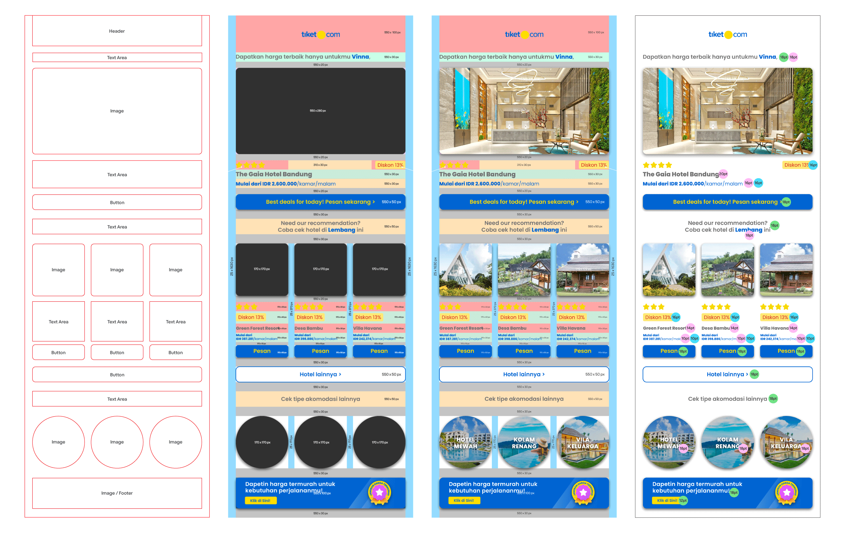
In collaboration with the Brand Performance team established a strong foundation in terms of visuals, content, and format, ensuring coherence from both brand and sales perspectives: immersive visuals that align with brand guidelines, clear communication, and agility in meeting effective sales needs. There were two phases involved, one in designing and the other in directing/supervising.
*Initial plan and content/copywriting: Dimas Kurnia.

There is a next phase with greater responsibility in art direction and monitoring performance trends, making visual and content refreshment more significant. This aspect of art direction includes grid systems, visual style, punchier content, and determining sequences through effective storyboarding while ensuring communication aligns with brand guidelines and sales objectives.
*Initial plan and content: Reza Karunia. Creative Designer: Aprilia Cahyani, Faradiba Maharani.





• Paid Ads: Method & Direction
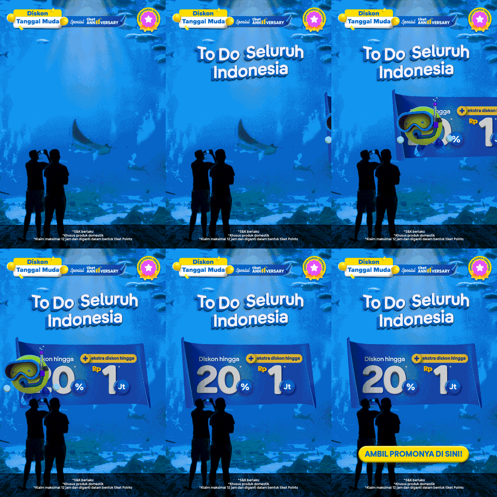
Paid ads for performance marketing require specific content and visual approaches tailored to target users based on historical data. Supported by insights from the performance team and quality control from the content team, these ads are structured into quarterly iterations to ensure a clear and measurable output. In this direction phase, the creative team found the initiate method Feedback & Scale as basis of the Narrative Styleguide approach: Tweakening, PUNchy, BOLDjective, and QCutting. By leveraging historical performance data, multiple ad variations are tested to ensure comparability and validity in both marketing objectives and visual/message contrast. *Content/copywriting: Reza Karunia. Creative Designer: Agung Puji Hartanto.


Tweakening: The starting point for digesting a brief, tweaking content, context, and concept while referencing guidelines, refining, and verifying until the core narrative aligns with the brief’s objectives and target users. "Awakening a new point of view."
PUNchy: Digital banners demand instant attention, much like billboards, the clearer the copy, the easier it is to grasp. A sharp, compact message with a pun delivers impact, much like a boxer’s well-placed punch.
BOLDjective: Bold copy paired with the right objective makes visuals more effective, guiding users with a coherent context. This phase ensures alignment with user behavior, verifying landing pages and interaction insights.
QCutting: A blend of Quality Control and Cutting—trimming excess elements like lengthy CTAs, oversized banners, or extended motion sequences to maintain clarity and efficiency.


In collaboration with Employee Branding team, designed and supervised the logo design and a set of visual branding assets for Learning Festival 2022: Celebrating Diversity through talks, food festivals, cultural engagement, and much more fun. The logo design was inspired by the shape of a torch and a handprint, symbolizing the spirit of learning and active participation in driving positive change.
*Visual graphic exploration and t-man 3D modeling by Faradiba Maharani & M.Iqbal Farhan.
• Branding: Learning Fest 2022


munu-munu is a pearl from a beautiful beach in Lombok who can speak, run, and enjoy a vacay with you. His presence at tiket.com with t-man is to strengthen the human side of the brand that aims to make t-mates feel even closer to tiket.com brand. By reason of his expressive character, munu-munu also easily shows his emotions, whether it’s negative or positive. munu-munu doesn’t represent tiket.com brand, but rather a reflection of life problems that can always be solved by t-man and tiket.com. As tiket.com's hero, t-man is always able to find solutions to every problem faced by munu-munu and bring joy to everyone. *Copywriting supported by Rizky Pradipta, 3D modeling by Winda Dwi Amalia, Rizal Zulfadli.
• munu-munu & tuchy


Introducing tuchy, the shy, polite, sweet, and gentle Stratocumulus cloud. He’s a member of t-man Universe and also a best friend of t-man and munu-munu. tuchy is their companion when exploring various interesting destinations around the world. The name tuchy comes from Touchy, which can be interpreted as "oversensitive" or easily touched. As the name implies, the character of tuci has a soft heart and is easily influenced, both by negative and positive emotions. However, tuci is a polite cloud and doesn’t talk too much unless asked or provoked first.
*Copywriting supported by Rizky Pradipta, 3D modeling by Winda Dwi Amalia, Rizal Zulfadli.


• Newsletter: Craft & Direction
In collaboration with the Brand Performance team established a strong foundation in terms of visuals, content, and format, ensuring coherence from both brand and sales perspectives: immersive visuals that align with brand guidelines, clear communication, and agility in meeting effective sales needs. There were two phases involved, one in designing and the other in directing/supervising.
*Initial plan and content/copywriting: Dimas Kurnia.

There is a next phase with greater responsibility in art direction and monitoring performance trends, making visual and content refreshment more significant. This aspect of art direction includes grid systems, visual style, punchier content, and determining sequences through effective storyboarding while ensuring communication aligns with brand guidelines and sales objectives.
*Initial plan and content: Reza Karunia. Creative Designer: Aprilia Cahyani, Faradiba Maharani.


• tiket live
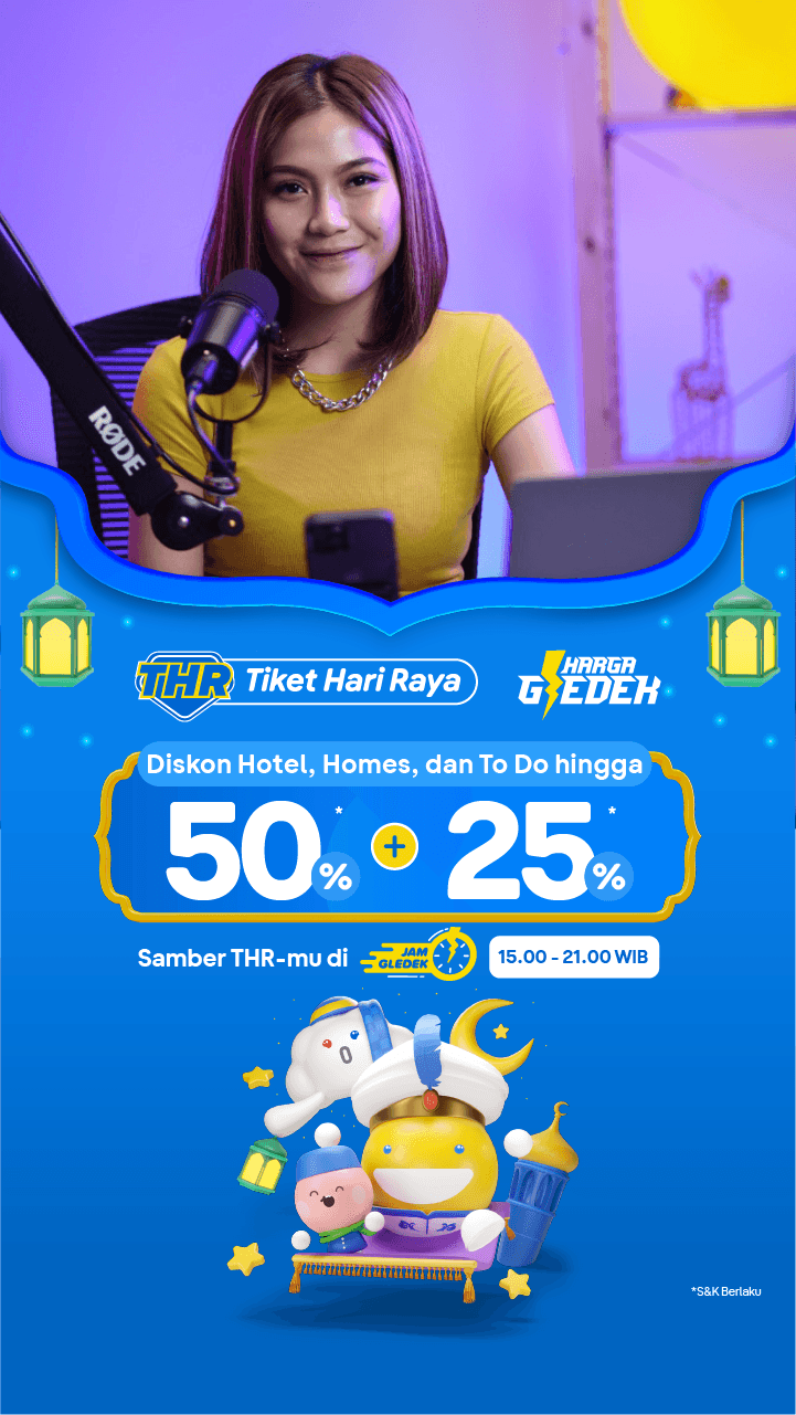
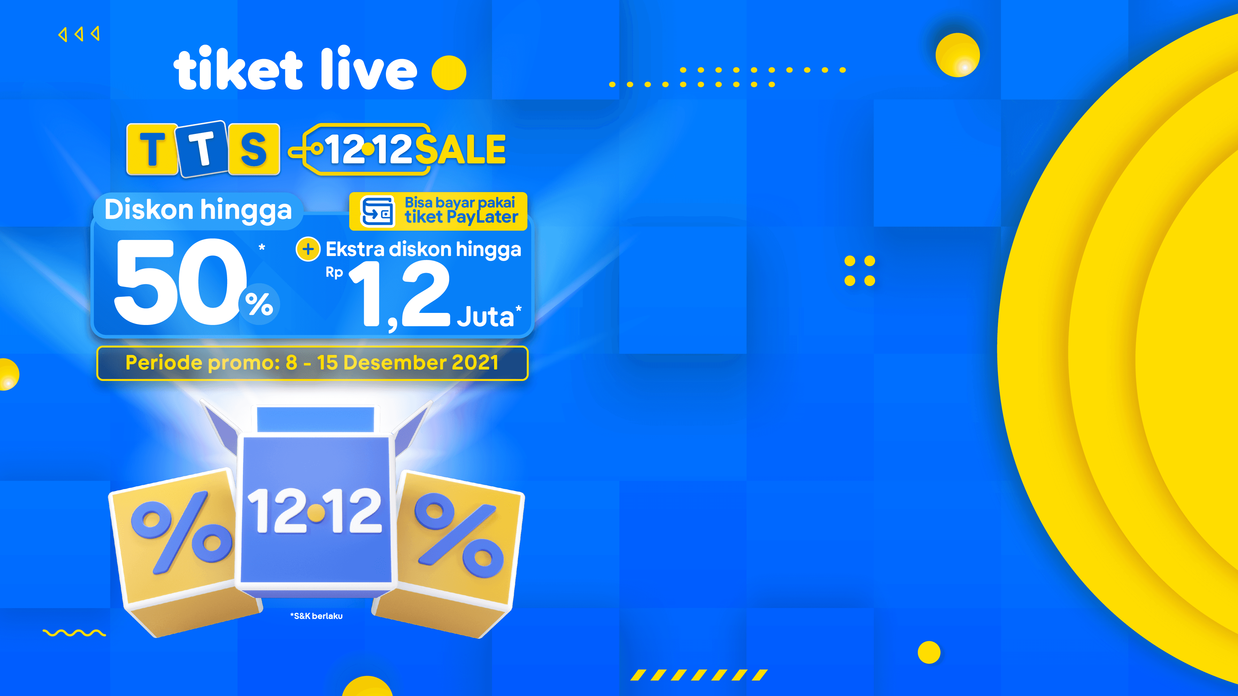
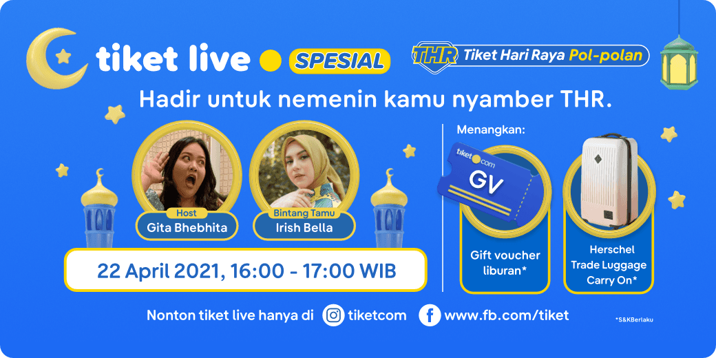
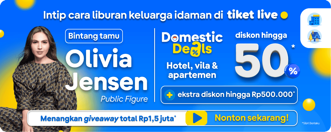
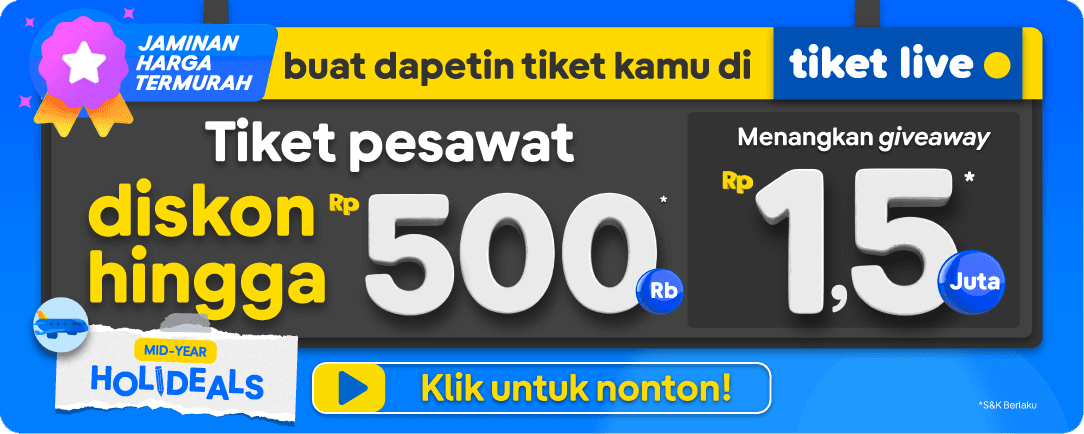
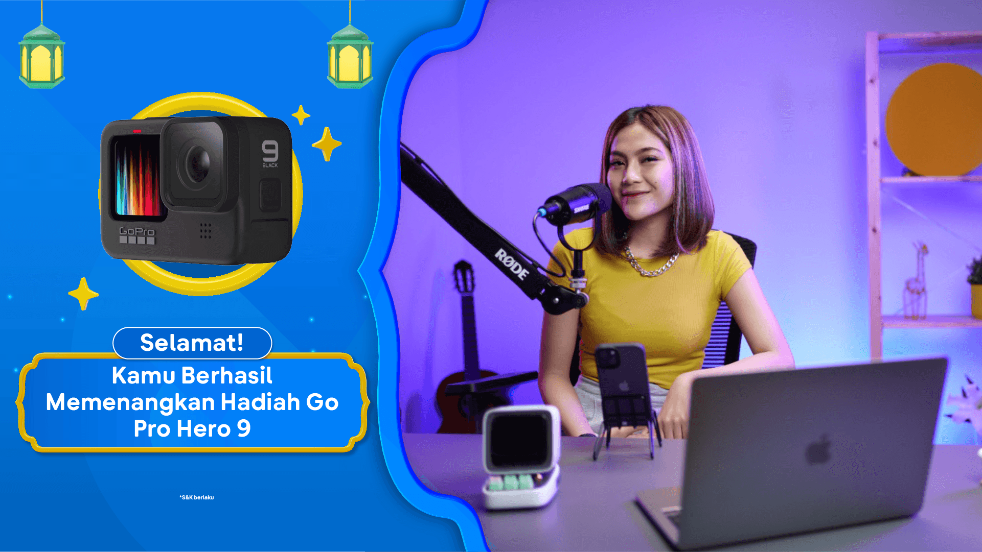
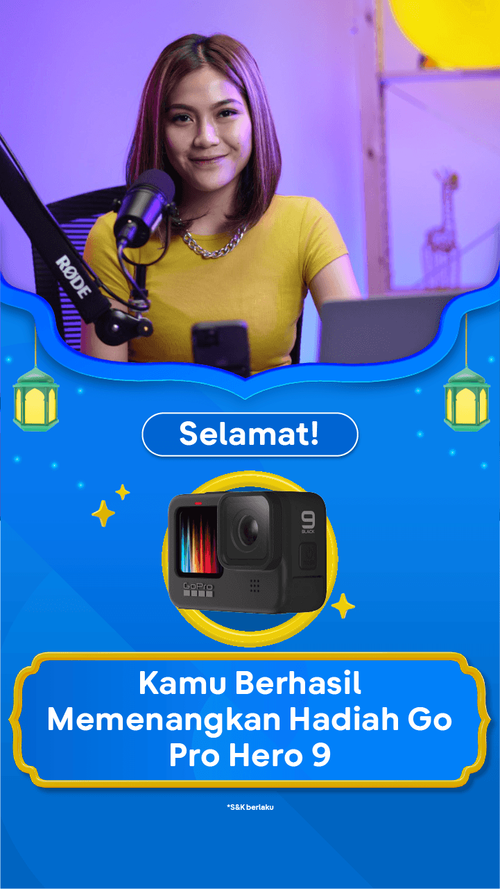
tiket live is an interactive, multi-platform broadcasting initiative spanning Instagram, YouTube and TikTok, and our native App, designed to drive sales and audience engagement through real-time promotions and product showcases. Serving as the creative associate for this program involves spearheading the end-to-end visual identity and art direction, from designing tailored digital assets and dynamic live overlays to overseeing the overall on-screen aesthetics and set design. Acting as the creative liaison, this role requires seamless collaboration with cross-functional stakeholders including brand marketing teams, technical producers to effectively translate strategic business objectives into compelling, brand-aligned visual narratives that elevate the live viewing experience.
*3D Design & Creative Designer: Winda Dwi Amalia.




Paid ads for performance marketing require specific content and visual approaches tailored to target users based on historical data. Supported by insights from the performance team and quality control from the content team, these ads are structured into quarterly iterations to ensure a clear and measurable output. In this direction phase, the creative team found the initiate method Feedback & Scale as basis of the Narrative Styleguide approach: Tweakening, PUNchy, BOLDjective, and QCutting. By leveraging historical performance data, multiple ad variations are tested to ensure comparability and validity in both marketing objectives and visual/message contrast. *Content/copywriting: Reza Karunia. Creative Designer: Agung Puji Hartanto.
• Paid Ads: Method & Direction


Tweakening: The starting point for digesting a brief, tweaking content, context, and concept while referencing guidelines, refining, and verifying until the core narrative aligns with the brief’s objectives and target users. "Awakening a new point of view."


PUNchy: Digital banners demand instant attention, much like billboards, the clearer the copy, the easier it is to grasp. A sharp, compact message with a pun delivers impact, much like a boxer’s well-placed punch.


BOLDjective: Bold copy paired with the right objective makes visuals more effective, guiding users with a coherent context. This phase ensures alignment with user behavior, verifying landing pages and interaction insights.


QCutting: A blend of Quality Control and Cutting—trimming excess elements like lengthy CTAs, oversized banners, or extended motion sequences to maintain clarity and efficiency.


• tiket live
tiket live is an interactive, multi-platform broadcasting initiative spanning Instagram, YouTube and TikTok, and our native App, designed to drive sales and audience engagement through real-time promotions and product showcases. Serving as the creative associate for this program involves spearheading the end-to-end visual identity and art direction, from designing tailored digital assets and dynamic live overlays to overseeing the overall on-screen aesthetics and set design. Acting as the creative liaison, this role requires seamless collaboration with cross-functional stakeholders including brand marketing teams, technical producers to effectively translate strategic business objectives into compelling, brand-aligned visual narratives that elevate the live viewing experience.
*3D Design & Creative Designer: Winda Dwi Amalia.
